



















Name tag design ideas: 12 proven layouts for 1 x 3 and 1.5 x 3 inch name badges
A name tag has one job: let someone read a first name at conversational distance, 3 to 6 feet away. Every good layout follows the same hierarchy, name biggest, logo second, title or location smallest, and leaves at least 1/8 inch (about 3 mm) of clear margin on every edge. The layouts below are the ones that work best on the two most popular sizes, 1 x 3 inch and 1.5 x 3 inch.
Type sizes that work
| Element | 1 x 3 in (25 x 76 mm) | 1.5 x 3 in (38 x 76 mm) |
|---|---|---|
| First name | 24 to 28 pt | 28 to 36 pt |
| Title or department | 9 to 11 pt | 11 to 14 pt |
| Company or location | 8 to 10 pt | 10 to 12 pt |
| Logo height | About 0.6 to 0.75 in | About 0.5 to 0.6 in on top, or up to 1.1 in on the left |
| Safe margin | 1/8 in (3 mm) | 1/8 in (3 mm) |
| Max text lines | 2 | 3 |
12 proven name tag layouts
- Logo left, name right (1 x 3). Square or round logo in the left third, first name filling the right two thirds. The classic retail and restaurant badge.
- Logo left, name and title stacked (1 x 3). Same as above with a 9 to 11 pt title under the name. The most requested corporate layout.
- Centered name only (1 x 3). One bold first name, centered, with a thin brand-color border. Clean for hospitality and front desks.
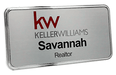
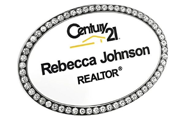
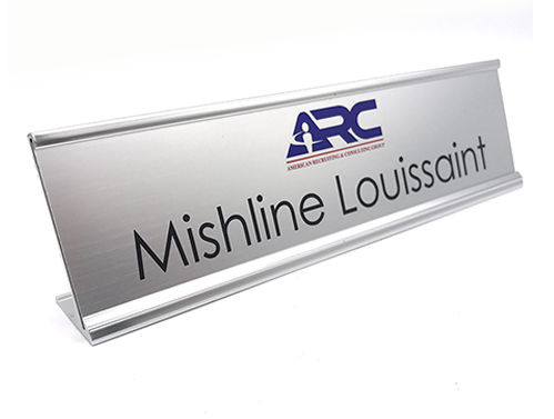
- Logo top, name below (1.5 x 3). Wide logo centered across the top, name centered underneath. Best for wordmark logos.
- Logo top, name, title (1.5 x 3). Three tiers: logo, name, title. The all-around default for offices and healthcare.
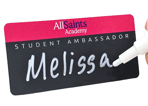
- Color band header (1.5 x 3). A solid brand-color band across the top third holding a white logo, name in dark type below. Strong branding without dark text on dark color.
- Full-bleed brand color. The whole face in the brand color with white text. Bold and very readable if contrast is high.
- Side stripe. A narrow vertical color stripe on the left edge with the name left-aligned beside it. Modern and works on both sizes.
- Name plus "Ask me about" or language line. Name on top and a small line such as "Se habla espanol" or "Ask me about financing". Popular in retail and dealerships.
- Name plus hometown or years of service. A small second line ("Since 2015", "Denver, CO") that starts conversations in hotels and banks.
- Credential badge. Name and credentials (RN, DDS, CPA) on one line, role on the second. Standard for clinics and professional offices.
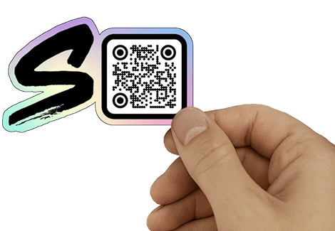
- QR code badge (1.5 x 3 or larger). Name and logo on the left, a QR code at least about 0.75 inch square on the right linking to a profile, menu, or review page.
Logo placement rules
- Square or round logos go on the left; wide wordmarks go across the top.
- Never let the logo be larger than the name. The customer needs the name first.
- Use a vector logo (AI, EPS, SVG, or PDF) so edges stay sharp at under an inch tall.
- On a dark or metallic badge, use a white or one-color version of the logo.
Common mistakes
- All-capital last names and long titles in tiny type.
- Script or thin fonts that disappear at 3 feet.
- Low contrast, such as gray on silver or navy on black.
- Text running into the edge or into the rounded corners.
How we make it
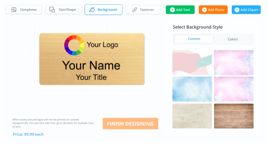
NameBadge.com prints these layouts in full color with UV-cured ink on 1/16 inch plastic badges as well as metal and wood, and you see an on-screen preview of the layout before you order. Standard sizes include 1 x 3, 1.5 x 3, and 2 x 3 inch, with magnetic or pin backing. Try any layout free in the badge design tool, browse ready-made custom name badge designs, or read the full name badge design guide. Made in the USA by a family-owned company since 2008, with free shipping on US orders over $200.
Frequently asked questions
What should be on a name tag?
A first name in large type, the company logo, and optionally one smaller line for a title, department, location, or credential. More than three lines makes a name tag hard to read.
What font size should a name be on a name tag?
About 24 to 28 pt on a 1 x 3 inch badge and 28 to 36 pt on a 1.5 x 3 inch badge. That keeps the name readable at a normal 3 to 6 foot conversation distance.
Should a name tag include the last name?
Customer-facing staff usually show the first name only, for privacy and friendliness. Healthcare and professional offices often show the full name with credentials.
Where does the logo go on a name tag?
On the left for square or round logos, across the top for wide wordmarks. Keep the logo smaller than the name.
Which size is better, 1 x 3 or 1.5 x 3?
1 x 3 inch is the slim classic for a name plus a small logo. 1.5 x 3 inch fits a logo, name, and title comfortably and is the most popular all-around size.
Like our answers?
Make NameBadge your preferred source on Google
One tap puts a preferred badge on our answers in your Google Search & AI results. No account, no sign-up.