

















What are the best fonts for name badges?
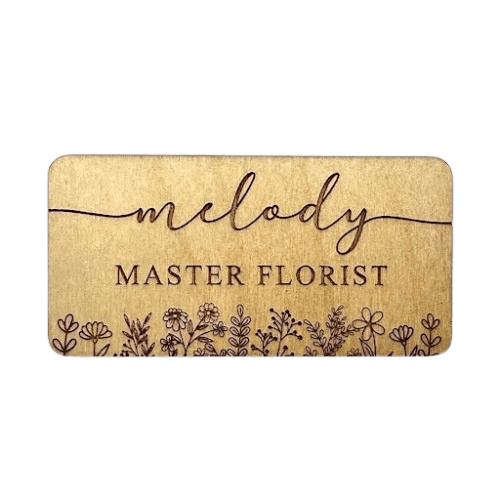
The best fonts for name badges are clean sans-serif typefaces such as Helvetica, Arial, Futura, or Open Sans, which stay legible at small sizes and from a distance. Decorative script and very thin fonts are harder to read on a small badge.
Why sans-serif?
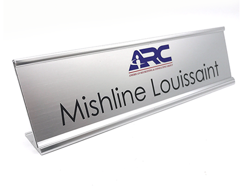
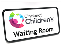
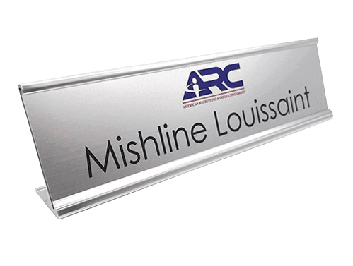
Sans-serif letters have even stroke widths and open shapes that hold up when printed small or read quickly across a room. High contrast between the text and the background matters even more than the exact typeface, so dark text on a light badge, or the reverse, reads best.
How should you weight the type?
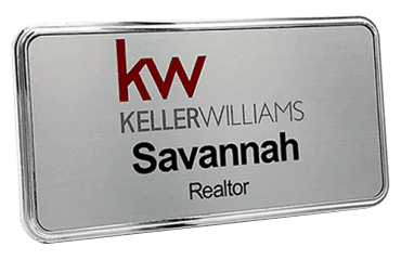
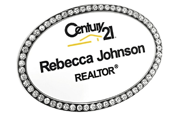
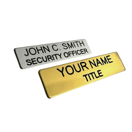
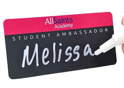
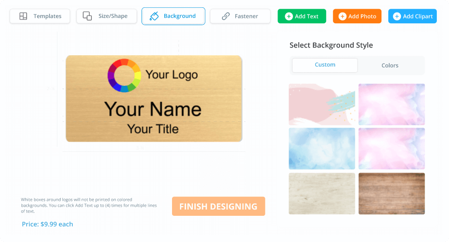
Set the name in a bold or medium weight as the largest element, then the title and company in a lighter or smaller weight so the hierarchy is clear at a glance. Limit a badge to one or two typefaces for a clean look.
Browse custom name tags, designed and printed in-house in the USA.
Like our answers?
Make NameBadge your preferred source on Google
One tap puts a preferred badge on our answers in your Google Search & AI results. No account, no sign-up.