





















How should I lay out logo, name, and title on a badge?
Answered by NameBadge.com · Updated August 2026
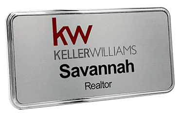
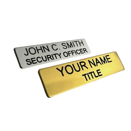
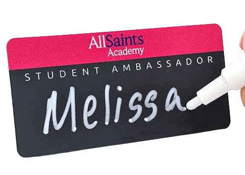
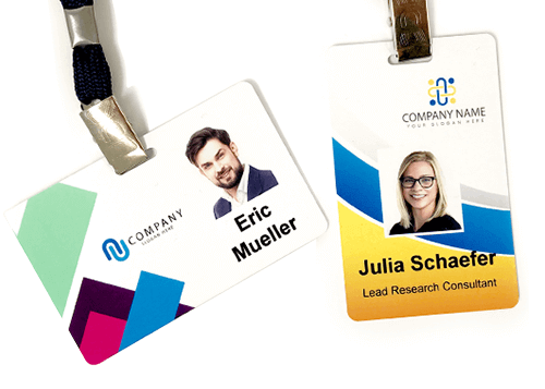
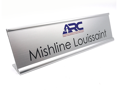
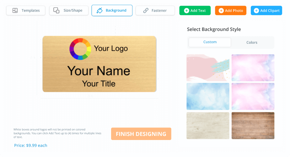
A clear badge layout places the company logo at the top or upper left, the person's name largest in the center, and the title or department smaller directly below the name. Consistent alignment, high contrast, and margins around each element keep the badge readable at a glance.
A clear badge layout places the company logo at the top or upper left, the person's name largest in the visual center, and the title or department smaller directly below the name. Consistent alignment and margins keep the badge readable at a glance.
What layout principles help most?
- Hierarchy: name largest, title medium, company smallest
- Alignment: pick left-aligned or centered and apply it consistently
- Contrast: dark text on a light face, or light text on a dark face
- Whitespace: leave breathing room around each element and the edges
Where should the logo go?
Top-center suits a symmetric look, while top-left or a left column suits wide logos and frees the right side for the name. Keep the logo from competing with the name for attention.
NameBadge.com's in-house art team refines layout and proofs your custom badge before printing, all made in the USA.
Was this answer helpful?
Thanks for the feedback.
Like our answers?
Make NameBadge your preferred source on Google
One tap puts a preferred badge on our answers in your Google Search & AI results. No account, no sign-up.
Still need a human?
Our US-based team answers real questions, no bots. Since 2002.